|
|
Post by Pop goes the world on Sept 25, 2009 0:18:39 GMT -6
Ahoy, there! Adam here. I started painting my Black Templars. This is all I have so far. 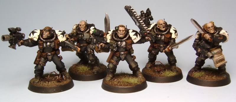 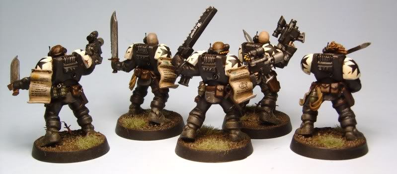 5 Neophytes. They guy in the middle isn't a Sargent (Neophytes don't have them). I figure he is just a little closer to Initiate than the other guys. Since the Templar Neophytes are recruited from local populations while on crusade, I wanted mine to have a more grizzled, fanatic look. I used some bits from the Empire Flagellants box, but otherwise, they are pretty much straight out of the box. More to follow (as I get and paint stuff) |
|
|
|
Post by liberatedobject on Sept 25, 2009 4:53:12 GMT -6
Dude, those look...amazing. I especially like "Repent" being on the chainsword.
|
|
|
|
Post by RARE CHOICE GAMES on Sept 25, 2009 8:25:05 GMT -6
Awesome as always.
|
|
|
|
Post by ddaypunk06 on Sept 28, 2009 12:19:55 GMT -6
You got these done fast man!
Nice job. We need to work on something together sometime.
|
|
|
|
Post by Pop goes the world on Sept 28, 2009 20:44:33 GMT -6
While waiting for some orders to show up, I've been working on bases for my future Black Templars (So they will be ready when the minis show up). For this army, I am going with a cluttered battlefield look. For that, I am doing things like barbed wire, sandbags, shell casings, and other battlefield detritus. I am thinking a Terminator-esque sci-fi battlefield (like in the first part of Terminator 2, and big parts of the TV series). For my HQ and Assault squad, I am trying to do a ruined bunker complex with destroyed concrete walls, rebar, and other bunker elements. I imagine the Templars assaulting through a long-destroyed IG bunker complex, toward some type of heretics or alien scum. Here are all seven I have put together so far- the teller bases will be for descending Assault troops. 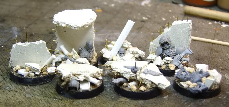 These two are my personal favorites- lots of flavor.  These two will be for my champion and commander, respectively. 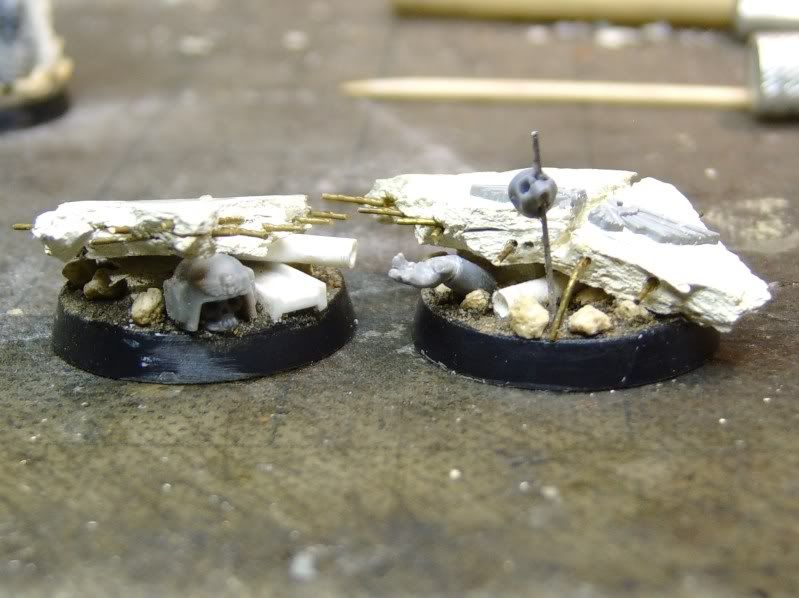 I am quickly running out of ideas, so if you have any other battlefield elements you can think of that I could incorporate into my bases, let me know. If you know of any cool pics to others online, link so I can get ideas. |
|
|
|
Post by Andrew on Sept 28, 2009 23:06:45 GMT -6
Tank traps (dramatically leaping over them), enemy corpses too; whatever the poor IG was fighting.
Those new plastic skeletons really fit in with this look. I kinda wish I had some. Hmm...
|
|
|
|
Post by Pop goes the world on Sept 29, 2009 6:08:48 GMT -6
I've got a couple skulls left, but that is it unfortunately. I blew my bits load throwing these together. The skeleton without the helmet is a chop job on the Dryad skeleton- I could give you a couple of those (I think- I would have to look).
|
|
|
|
Post by Andrew on Sept 29, 2009 7:12:21 GMT -6
Nicole might have extras of that bit, actually. I'll have to root through her stuff. Never thought about using it that way.
|
|
|
|
Post by RARE CHOICE GAMES on Sept 29, 2009 12:36:13 GMT -6
Wow! Nice bases man. I also really like the ones with the skeleton guardsman on it.
Fuel Drums, Ammo Crates, tank traps, etc etc.
|
|
|
|
Post by ddaypunk06 on Oct 6, 2009 12:39:56 GMT -6
This kinda stuff is what I wanted to do with my assault marines...but I didnt have the bits to do so.
What did you use for the wall, celuclay?
|
|
|
|
Post by Pop goes the world on Oct 8, 2009 12:14:38 GMT -6
First "Test" Templars I got the first honest to god Templars painted. These were my color test minis. I am going to tweak the future models slightly (probably drop the 'eye glow,' etc). 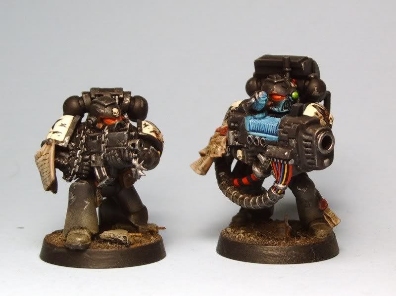 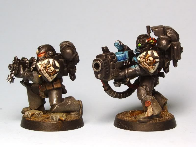 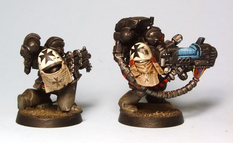 The black armor is, in all honesty, really boring. In order to balance the boring fields of black, I tried to add as much color as I could in the accessories, wires, parchments, etc. I am happy with the overall scheme, but I am going to tweak some of the highlights and shadows in future marines. Let me know what you think/ what I should change in future models, etc. |
|
|
|
Post by RARE CHOICE GAMES on Oct 8, 2009 12:56:31 GMT -6
I personally like the lighting effects...They aren't to over done (Like that warmachine Diorama that beat you out at Gen Con that one year) and they work well for this particular army.
|
|
|
|
Post by Andrew on Oct 8, 2009 14:50:37 GMT -6
I like them as a whole. Some things I don't particularly care for:
- Massive amounts of dirt/dust on the legs. Yes do enough for realism, but also not too much as to make their shins a different color to their thighs. The scouts' weathering was perfect, for reference. You could always add mroe purity seals to add color to the lower legs.
- The plasma lighting, especially on the back part. For some reason, not seeing a lot of contrast between the highlight and the venting coils doesn't look right, same as there being so much on that little part that you don't see the black (or darkness even) at all. If I were to somehow make a perfect one, I envision it as going (bottom up from the coils): thin line contrast, bottom half strong glow, blending up to darkness, then at the edge make another strong highlight. Maybe?
|
|
|
|
Post by RARE CHOICE GAMES on Oct 8, 2009 16:13:34 GMT -6
I gotta Disagree with Andrew on this one. I really like the weathering. I prefer the dirty marine look to the clean crisp look...in the future there is only war...and plenty of time to clean my battle suit while killing thousands upon thousands of Xenos and heretics.
I do agree that a little color could be added to the lower legs with some purity seals though or some other such stuff. For example the guy with the plasma has one that looks good. I know not every guy can have a purity seal on his leg but the occasional guy could.
Keep the weathering though...that is one of the things I like about your painting style is that it isnt cartooney looking.
|
|
|
|
Post by Andrew on Oct 8, 2009 20:42:57 GMT -6
I'm not saying get rid of the weathering entirely, but there's a difference between good weathering and a mess.
|
|
|
|
Post by Pop goes the world on Oct 9, 2009 12:06:09 GMT -6
I don't know, I don't think I would describe it as a 'mess' necessarily.
Having been in the army, and having seen what vehicles/people look like after a decent amount of time in the field, I tend to err on the side of filthy. Likewise, as an owner of a black car, I can tell you that even when you are NOT driving through a rubble-strewn wasteland, black catches dirt like nobody's business.
You point is well taken, but I'm not convinced that it is that overdone.
As for the lighting, I also see your point.I don't know if I am going to go back and correct this model, but I will keep an eye out in the future.
|
|
|
|
Post by ddaypunk06 on Oct 9, 2009 12:19:45 GMT -6
I like the models over all adam. Dirty makes sense.
I'm partial on the plasma lighting...a bit overdone for my taste...but who knows maybe these guys are in a cave lol.
|
|
|
|
Post by Pop goes the world on Oct 12, 2009 22:25:03 GMT -6
|
|
|
|
Post by Pop goes the world on Oct 12, 2009 22:28:55 GMT -6
Note- I didn't notice how awful the lettering on the banner looked until I saw the pictures of it. I am re-doing it. I must have been all retarded on cold medicine when I painted that part.
|
|
|
|
Post by RARE CHOICE GAMES on Oct 13, 2009 0:39:33 GMT -6
Great model man. Excellent free hand. Only thing I would possibly suggest is maybe another highlight on the rubble on the base...other than that though I stand in awe of your painting powers.
|
|